

Pantone’s 2026 Color of the Year: A Radical Reset or Just a Blank Page?
Every December, the design world holds its collective breath, waiting for the Pantone Color Institute to declare the shade that will define the year ahead. We expect vibrancy. We expect a statement. We expect, well, color. But for 2026, the global color authority has thrown us a curveball that is as quiet as it is controversial.
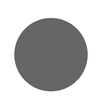
Pantone’s 2026 Color of the Year is Cloud Dancer (11-4201). And yes, it is essentially white.
This choice has sent ripples of confusion, relief, and debate through the creative industries. Is it a stroke of genius, offering a clean slate for a chaotic world? Or is it a sign of creative fatigue? To understand the true weight of this decision, we have to look past the initial shock of the “non-color” and dive into the psychology, the application, and the heated conversation surrounding this unprecedented pick.
Deconstructing Cloud Dancer: More Than Just “White”
To dismiss Cloud Dancer as merely “white” is to miss the nuance that Pantone—the world’s primary arbiter of hue—relies upon. Technically, Cloud Dancer (11-4201) is described not as a stark, optical bright white (which can feel sterile or hospital-like), but as a “billowy, balanced white.”
The Technical Nuance
Unlike the cool, blue-tinted whites of technology or the yellow-heavy creams of the past, Cloud Dancer sits in a unique middle ground. It possesses an “aerated” quality, designed to mimic the feeling of a cloud moving across a sky. It holds equal parts warm and cool undertones, making it a “chameleon” shade that changes character depending on the light and the colors it is paired with.
In their official announcement, the self-described “color authority” positioned this choice not as an absence of color, but as “a symbol of calming influence in a frenetic society rediscovering the value of measured consideration and quiet reflection.” It is a structural color—a foundation upon which other things can be built, rather than the decoration itself.
The Psychology of the Choice: Why Now?
Why, after 26 years of selecting bold blues, radiant orchids, and living corals, has Pantone chosen a shade that effectively disappears? The answer, according to the Institute, lies in the collective psyche of the global population.
A Reaction to a “Frenetic Society”
The language used to describe Cloud Dancer is decidedly therapeutic. Pantone suggests that the color “signifies our desire for a fresh start.” In a world dominated by 24-hour news cycles, digital noise, and political polarization, our visual bandwidth is maxed out. Cloud Dancer is the visual equivalent of noise-canceling headphones.
“Peeling away layers of outmoded thinking, we open the door to new approaches,” the Institute stated. “Cloud Dancer quiets the mind, encouraging true relaxation and focus that allows the mind to wander, and creativity to breathe, making room for innovation.”
In a press statement, Laurie Pressman, the Vice President of the Pantone Color Institute, elaborated on this existential theme. She noted that this “airy white hue… exemplifies our search for balance between our digital future and our primal need for human connection.” The implication is clear: we don’t need more stimulation; we need space. We need a blank page.

A Historic Departure: The Contrast with Yesterday
To fully appreciate the boldness of choosing a white, one must look at the trajectory of recent years. The selection of Cloud Dancer marks the first time in the program’s 26-year history that a white hue has taken the crown. This is a massive pivot from the immediate past.
From Mocha Mousse to Blank Slate
Just last year, the Color of the Year for 2025 was Mocha Mousse, a deep, dark-hued brown that evoked indulgence, chocolate, and earthy roots. Before that, we had Peach Fuzz (2024), a warm, fuzzy tactile orange meant to inspire connection, and Viva Magenta (2023), a brave and fearless red.
Shifting from the “richness” of Mocha Mousse to the “nothingness” of Cloud Dancer signals a potential end to the era of “dopamine decor” (the trend of using bright, happy colors to induce joy). Instead, we are entering an era of “reductive design,” where stripping away the excess is the ultimate luxury. It is a pivot from having to being.
Industry Reactions: The Good, The Bad, and The “Boring”
As with any major trend announcement, the reaction was immediate and polarized. The choice has exposed a divide between those who crave peace and those who crave expression.
The Skeptics and The “Boring” Verdict
Social media platforms were instantly flooded with befuddlement. On Pantone’s Instagram, users didn’t hold back. “I guess we’re all feeling completely uninspired these days,” wrote one commenter, capturing the sentiment that white feels like a “give up” move.
Another user lamented, “We used to look up to Pantone literally for some color in our lives. Now the future feels… charmless.” For many, the Color of the Year is supposed to be a challenge—a color that pushes designers to try something new. White, by contrast, feels like the default setting.
Media outlets were equally skeptical. The New York Post bluntly called the choice “boring.” NJ.com reported that “the internet is not impressed,” noting that “people want an actual color.”
The “Reset” Perspective
However, not everyone hates the blank slate. The New York Times style staff held their annual roundtable to dissect the choice, and their take was surprisingly philosophical.
Features writer Alex Vadukul offered a sensory defense of the shade. “The name sounds like a 1980s one-hit-wonder track,” he joked, before adding, “From a sensory point of view, I think I’m a fan. There’s something exploratory and a bit mysterious about it. Also confident.”
Reporter Jacob Gallagher provided a cultural analysis that perhaps explains the choice better than Pantone did. “I do understand why a blank slate might be the right pick for this moment,” Gallagher remarked. “Culture right now is pretty darn stagnant—everything feels like a rehash of a rehash.… It’s an ideal pick for this fence-sitting period where no one wants to offend anyone.” In this light, Cloud Dancer isn’t just a color; it’s a mirror of a culture that is afraid to make the wrong move.
The Jewelry & Fashion Impact: “Slightly Disappointed” or “Superchic”?
Specific industries rely heavily on Pantone’s forecast to drive sales, and the jewelry world has offered some of the most pragmatic critiques of Cloud Dancer.
The Challenge for Gemstones
Amy Elliott, a prominent voice in the jewelry industry, believes that gem-lovers will be “slightly disappointed” by the lack of saturation. “Pantone serves us best when it lands on greens and pinks and reds and lavenders—colors that surface in the rainbow of gemstones that inspire so many of our designers,” she explains.
When the color of the year is Emerald or Radiant Orchid, the path for a jewelry designer is clear. When it is white, the options narrow. “Few of us have strong opinions about the color white,” Elliott says. She notes that pearls are “an obvious correlate to Cloud Dancer,” but since pearls are a perennial classic that never truly go out of style, this pick is “unlikely to fuel new demand” in the way a trendy, obscure color might.
The “Silver Lining” in Design
However, Elliott admits there is a metaphorical upside: “Nevertheless, a silver lining to this Cloud might be that it is, in fact, signaling a reset of some kind—a ‘clean slate’ that allows us to cleanse and declutter our minds and spirits with something calming, peaceful, and neutral.”
Jennifer Heebner, editor-in-chief of the American Gem Trade Association (AGTA) publication Prism, sees practical potential for the high-end market. “In jewelry, designers and retailers can find the Cloud Dancer color in rainbow moonstone, which has been wildly popular at the high end for several years,” Heebner advises.
She also suggests looking beyond just the stone itself to the metal and setting. “White cultured akoya and South Sea pearls are more obvious choices to get the color in inventory,” Heebner says. But the real magic lies in styling. “Cloud Dancer is going to be easy to color-block with anything, really, and I think muted tone options like soft gray spinel, matte-finished gold jewels, or light brown diamonds paired with it will look superchic and luxe.”

How to Style Cloud Dancer in 2026
If you are looking to incorporate Cloud Dancer into your life without it looking like you simply forgot to paint your walls, the secret lies in texture and layering.
In Interior Design
Because Cloud Dancer lacks strong pigment, it relies on light and shadow to create interest.
- Layer Textures: Do not just paint the walls Cloud Dancer and leave it there. Pair the color with bouclé fabrics, unbleached linens, and sheepskin rugs. The variation in surface creates a “monochromatic richness.”
- Play with Light: This specific shade of white is designed to be “billowy.” Use sheer curtains that allow natural light to diffuse through the room, enhancing the “cloud-like” atmosphere.
- Matte Finishes: High-gloss white can look industrial. To capture the essence of Cloud Dancer, opt for matte or eggshell finishes on walls and ceramics to maintain that soft, chalky feel.
In Fashion and Wardrobe
Cloud Dancer is the ultimate evolution of the “Clean Girl” aesthetic, but elevated.
- Head-to-Toe Monochrome: The most high-fashion way to wear this color is a full suit or ensemble. A Cloud Dancer oversized blazer paired with matching wide-leg trousers makes a confident, sophisticated statement.
- Mixed Whites: Don’t be afraid to mix Cloud Dancer with other whites—creams, ivories, and bone shades. The subtle differences prevent the outfit from looking like a uniform.
Conclusion: The Courage to Be Blank
Ultimately, Pantone’s choice of Cloud Dancer is a Rorschach test for the viewer. To the cynic, it is a boring cop-out by a company running out of ideas. To the optimist, it is a much-needed breath of fresh air—a pause button pressed on a world that is spinning too fast.
Whatever your stance, Cloud Dancer forces us to confront the “noise” in our own lives. It asks us what we would build if we were given a completely fresh start. It might not be the most exciting color to look at on a swatch, but as a concept, it might be exactly what 2026 needs. After years of shouting with color, perhaps it is finally time to whisper.
