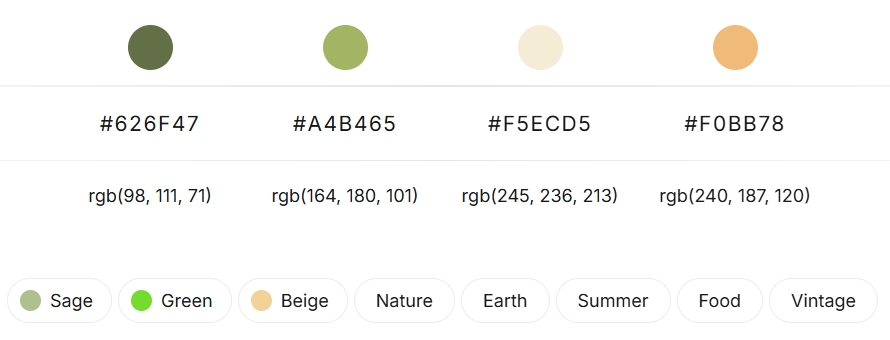
In the competitive luxury market, jewelry watch packaging is far more than a mere container; it’s the first tactile interaction a customer has with your brand, setting the stage for the treasure within. A thoughtfully chosen color palette can evoke emotion, communicate brand values, and significantly enhance perceived value. The sophisticated, nature-inspired quartet of Deep Olive Green, Soft Sage Green, Creamy Ivory, and Warm Terracotta offers a compelling direction for modern jewelry and watch packaging.
The Palette: A Symphony of Understated Sophistication
Deep Olive Green(#626F47):
This grounding hue exudes a sense of timeless luxury and natural richness. It’s strong yet subtle, suggesting heritage and quality.
Soft Sage/Moss Green(#A4B465):
Bringing a lighter, calming touch, this color speaks to organic elements, serenity, and contemporary minimalism.
Creamy Ivory/Off-White(#F5ECD5):
The quintessential neutral for luxury, Ivory provides a clean, elegant canvas. It offers brightness and contrast, making other colors pop and allowing the product to shine.
Warm Terracotta/Sandstone(#F0BB78):
This earthy, inviting tone adds a touch of warmth and artisanal charm. It’s unique and memorable, hinting at craftsmanship and a connection to the earth.

Pairing Suggestions for High-Impact Packaging:
This palette offers remarkable versatility. Here’s how to weave these colors into stunning packaging designs:
The “Luxe Naturalist” Approach:
Exterior Box:
Deep Olive Green with a matte or slightly textured finish.
Logo/Branding:
Hot-stamped in a subtle gold or copper, or debossed for a tactile feel.
Interior Lining:
Creamy Ivory or Soft Sage Green in velvet, suede, or silk to cushion the jewelry/watch.
Ribbon/Pull Tab:
Warm Terracotta, providing a delightful, unexpected pop of color upon opening.
Insert Card/Booklet:
Creamy Ivory paper with Deep Olive Green or Terracotta typography.
The “Modern Minimalist” Approach:
Exterior Box:
Soft Sage Green or Creamy Ivory as the dominant color for a lighter, more contemporary feel.
Logo/Branding:
Crisp typography in Deep Olive Green or a blind emboss.
Interior Detail:
A contrasting band of Warm Terracotta or Deep Olive Green on the inner lid or base.
Cushion:
Creamy Ivory or Soft Sage, ensuring the product is the star.
The “Artisanal Warmth” Approach:
Exterior Box:
Warm Terracotta, perhaps with a texture reminiscent of handmade paper or stone.
Logo/Branding:
Creamy Ivory or a muted Deep Olive Green.
Interior Lining:
Creamy Ivory to brighten the reveal, or a surprising Deep Olive Green for dramatic contrast.
Accents:
A subtle Sage Green ribbon or trim.
Trend Analysis: Why This Palette Resonates Now
This color combination taps into several powerful current trends:
Connection to Nature & Sustainability:
Consumers are increasingly drawn to brands that reflect natural, organic, and eco-conscious values. These earthy tones inherently communicate this connection.
Quiet Luxury & Understated Elegance:
The palette moves away from ostentatious displays, favoring sophisticated subtlety. It speaks to a discerning customer who appreciates quality and timeless design over flashy branding.
Wellbeing and Calm:
The greens and warm neutrals evoke a sense of calm, grounding, and tranquility – desirable qualities in a hectic world.
Versatility and Gender Neutrality:
While inherently sophisticated, these colors can be styled to appeal to a broad demographic. The deeper tones can lean masculine, while the lighter shades and terracotta accents can feel more universally appealing or subtly feminine.
Attracting the End Customer: The Psychological Edge
Well-executed packaging using this palette can significantly influence purchasing decisions:
Elevated Perceived Value:
The rich, coordinated colors immediately suggest a premium product. Customers feel they are investing in something special.
Enhanced Unboxing Experience:
The journey of discovery, from the exterior box to the interior reveal, becomes a memorable moment. The interplay of these harmonious colors makes the experience more delightful and “Instagrammable.”
Emotional Connection:
These colors evoke positive associations – nature, stability, comfort, and sophistication – building an emotional bridge between the customer and the brand.
Brand Storytelling:
The palette can subtly reinforce a brand’s narrative, whether it’s about handcrafted quality, ethically sourced materials, or timeless design principles.
Differentiation:
In a sea of standard black, white, or bright jewel-toned boxes, this earthy yet elegant palette helps a brand stand out memorably.
Conclusion:
The blend of Deep Olive Green, Soft Sage Green, Creamy Ivory, and Warm Terracotta offers a powerful and versatile foundation for jewelry and watch packaging. It’s a palette that feels both contemporary and timeless, capable of conveying luxury, authenticity, and a deep connection to the natural world. By thoughtfully applying these hues, brands can create an unboxing experience that not only protects the product but also captivates the customer, fosters loyalty, and ultimately drives desire and sales.


