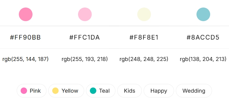
Elegant Jewelry and Watch Packaging unboxing experience is a critical touchpoint in the luxury goods market, especially for jewelry and watches. The colors chosen for packaging can significantly influence perception, evoke emotion, and reinforce brand identity. The provided palette—a beautiful blend of vibrant pink, soft pastel pink, creamy ivory, and serene sky blue—offers a versatile foundation for creating truly captivating packaging.
Understanding the Elegant Palette:
Vibrant Pink (#FF90BB):
A bold yet feminine hue. It speaks of confidence, playfulness, and modern romance. It can be a powerful accent or a statement base.
Pastel Pink (#FFC1DA):
Softer and more delicate than its vibrant counterpart. It evokes gentleness, sweetness, and subtle luxury. Ideal for creating a dreamy, inviting feel.
Creamy Ivory (#F8F8E1):
The neutral anchor of this palette. It signifies elegance, purity, and timeless sophistication. It provides breathing room and allows the other colors to shine.
Serene Sky Blue (#8ACCD5):
A calming, fresh, and modern hue. It offers a cool contrast to the warm pinks, adding a touch of tranquility and contemporary flair.

Elegant Packaging Design Strategies:
Here’s how to leverage this delightful quartet for stunning jewelry and watch packaging:
1. Minimalist Elegance with a Pop:
Concept:
Use Creamy Ivory as the dominant color for the exterior of the box (e.g., a matte finish textured paper).
Accent:
Employ the Vibrant Pink or Sky Blue for a discreet logo, a thin border, or the ribbon tie.
Interior:
Line the box with Pastel Pink velvet or satin for a soft, luxurious reveal.
Best for:
Brands aiming for a timeless, sophisticated look with a modern, gentle twist. Perfect for bridal jewelry or classic watch designs.
2. Romantic & Dreamy:
Concept:
Make Pastel Pink the primary exterior color.
Contrast & Detail:
Use Creamy Ivory for lettering, internal dividers, or a subtle pattern. The Sky Blue can be used for a delicate ribbon or an internal pouch.
Highlight:
A small touch of Vibrant Pink, perhaps on a thank-you card or a small brand tag, can add a focal point.
Best for:
Feminine jewelry brands, special occasion pieces (e.g., anniversaries, Valentine’s Day), or watches with a delicate aesthetic.
3. Modern & Fresh Contrast:
Concept:
Use Sky Blue as the main color for the box exterior, offering a contemporary and serene first impression.
Warmth Inside:
Contrast with a Pastel Pink or Vibrant Pink interior.
Neutral Grounding:
Creamy Ivory can be used for the product cushion, inserts, or subtle branding elements.
Best for:
Contemporary watch brands, minimalist jewelry, or brands targeting a younger, fashion-forward audience.
4. Color-Blocking Sophistication:
Concept:
Divide the packaging into distinct sections using two or three of the colors. For example, a Creamy Ivory box lid with a Sky Blue base, tied with a Vibrant Pink ribbon.
Balance:
Ensure one color remains subtly dominant or that the proportions are visually pleasing. The key is balance, not competition between colors.
Interior:
Could be a surprising contrast, like a Vibrant Pink interior in a predominantly blue and cream box.
Best for:
Bold, design-led brands that want their packaging to make an immediate statement.
5. Layered Harmony (Using All Four):
Concept:
This requires careful execution.
Box:
Creamy Ivory or Pastel Pink.
Ribbon:
Sky Blue.
Tissue Paper:
Vibrant Pink (or a pattern incorporating it).
Internal Pouch/Card:
A contrasting color from the palette.
Key:
Use Creamy Ivory generously to prevent the colors from overwhelming each other.
Best for:
Gift sets, special editions, or brands that embrace a playful yet chic identity.
Material & Finish Considerations:
Elegant matte Finishes:
Will give these pastels a sophisticated, contemporary feel.
Slight Gloss/Satin Finishes:
Can enhance the vibrancy of the pinks and the freshness of the blue.
Elegant textured Papers (Linen, Laid):
Add a tactile dimension that complements the softness of the palette.
Elegant velvet or Suedette Linings:
In Pastel Pink or Creamy Ivory, these will scream luxury.
Metallic Accents:
Consider rose gold foil stamping for logos or text – it would pair beautifully with all these colors. Silver could work well with the blue and cream.
In Conclusion:
This color palette of vibrant pink, pastel pink, creamy ivory, and sky blue offers a fantastic springboard for creating jewelry and watch packaging that is both memorable and aligned with a brand’s desired image. Whether aiming for subtle elegance, romantic charm, or modern freshness, these hues, when thoughtfully combined with appropriate materials and finishes, can elevate the unboxing experience and leave a lasting impression of quality and care.


