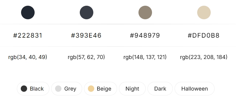
This sophisticated color palette evokes a sense of understated luxury and the tranquil beauty of twilight. It features a gradient of four horizontal bands, each offering a unique shade that can be strategically employed in jewelry and watch packaging design.
Top Band: Deep Charcoal (RGB: 34, 40, 49): This darkest shade represents the deep, pre-dawn sky. It exudes elegance and solidity, making it an excellent choice for the primary color of boxes, outer sleeves, or as an accent color for high-value pieces. Its depth provides a strong contrast to lighter metallic tones like silver or gold, commonly found in jewelry and watches.
Second Band: Slate Grey (RGB: 57, 62, 70): A softer transition from the deep charcoal, this slate grey offers a versatile and contemporary feel. It can be used for interior linings of boxes, providing a neutral backdrop that allows the jewelry or watch to stand out. This shade also works well for printed materials such as care instructions or brand booklets included in the packaging.
Third Band: Taupe Grey (RGB: 148, 137, 121): Introducing a touch of warmth, this taupe grey bridges the gap between the darker and lighter elements of the palette. It can be effectively used for cushioning inserts, display cards, or even the exterior of smaller packaging components. This color adds a subtle richness and sophistication.
Bottom Band: Pale Sand (RGB: 223, 208, 184): This lightest shade provides a gentle contrast and a touch of brightness. It can be used for ribbons, dust bags, or as a subtle highlight on printed branding elements. The pale sand evokes a sense of refinement and can create a pleasant tactile experience.

Color Palette Application in Jewelry and Watch Packaging:
To effectively utilize this palette, consider the following combinations:
High-End Watches:
A deep charcoal exterior with a slate grey interior and pale sand accents for ribbons or branding. This combination emphasizes the precision and value of luxury timepieces.
Fine Jewelry (Diamonds/Precious Metals):
A slate grey or taupe grey exterior can provide a sophisticated backdrop, while a pale sand interior lining can highlight the brilliance of diamonds. Deep charcoal accents can add a touch of drama.
Fashion Jewelry:
Experiment with combining the taupe grey and pale sand for a more approachable yet elegant feel. Slate grey can be used for subtle branding elements.
Color Palette Material Considerations:
The textures of the packaging materials can further enhance the impact of this color palette. Consider matte finishes for the darker shades to emphasize their depth, and subtle sheen or textured surfaces for the lighter tones to add visual interest. Sustainable and tactile materials will also elevate the perceived value of the packaged items.
By thoughtfully applying this twilight-inspired color scheme, brands can create jewelry and watch packaging that is both visually appealing and reflective of the quality and sophistication of the products within.


